Featured Designer: Laurie Fulkerson
When it comes to home design, color is a well-thought-out decision for our Twin designer, Laurie Fulkerson. Color can provide a glimpse into the homeowner’s personality, it can set a dramatic tone for a room, and it can give a subtle backdrop for furnishings and architecture. Laurie shares her go-to hues when helping a homeowner decide a palette.
Notable Neutrals
Grays are the ultimate neutral providing a variety of tones including blues, greens, and even browns. Laurie bases her choices on many factors, such as lighting, finishes, and surrounding room details.
[one-half-first]
[/one-half-first][one-half]
[/one-half][clearfix]
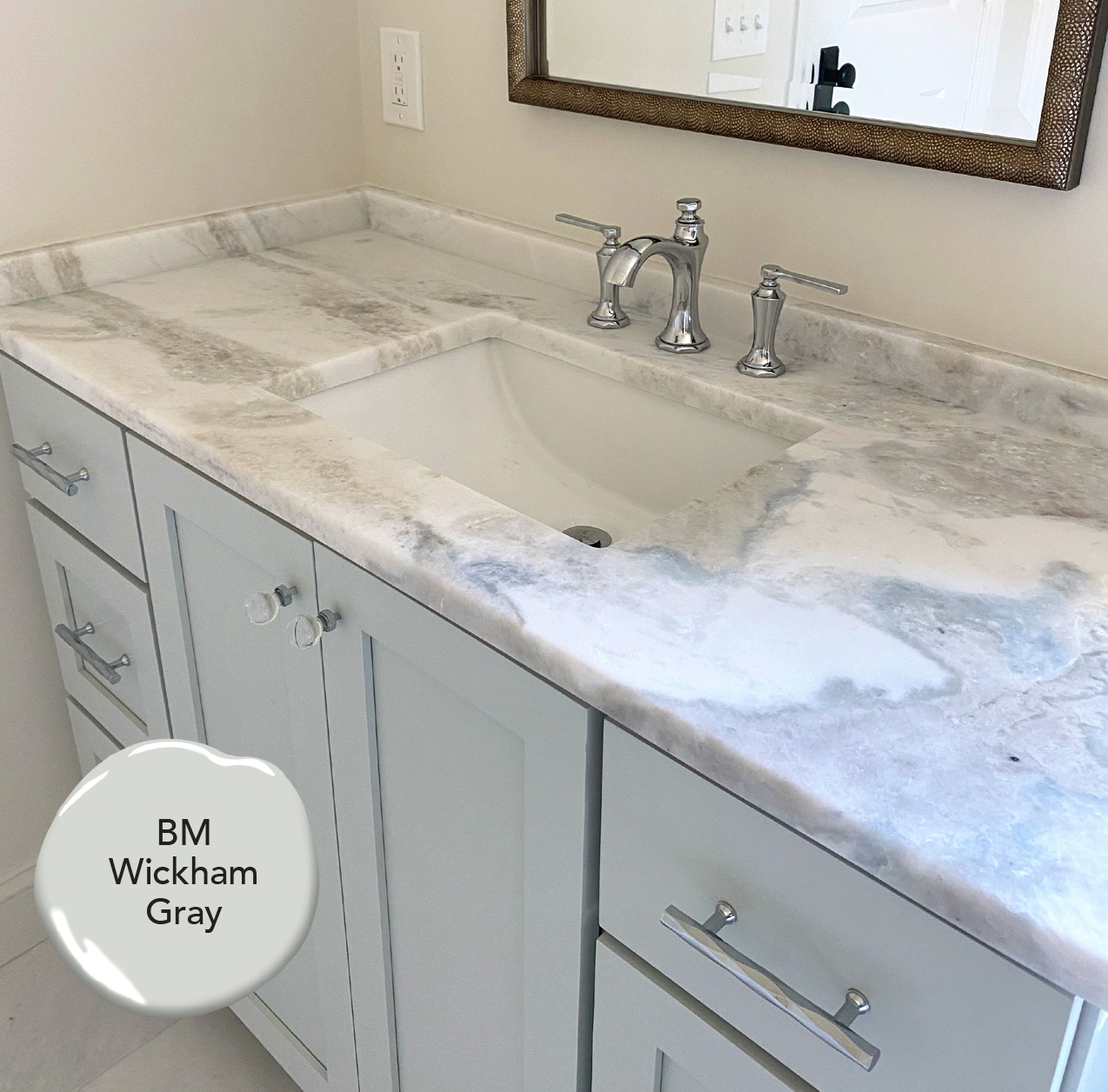
In the vanity photo above, Laurie used Benjamin Moore Wickham Gray because of its light blue undertones, which is found in the neighboring marble.
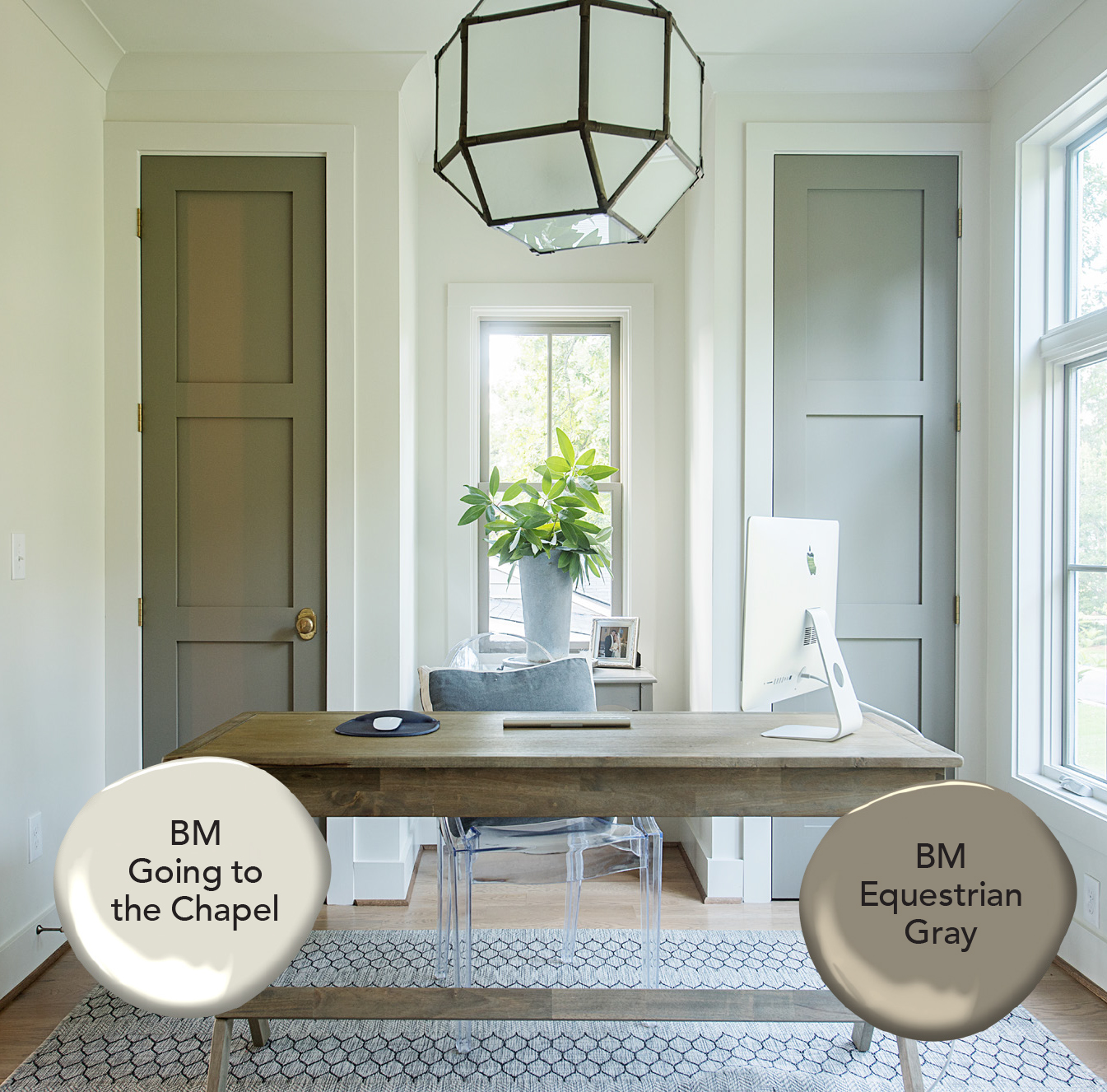
The next photo shows Laurie’s classic preference BM Going to the Chapel to provide a rich neutral. In order to draw your eye to the their architectural depth, the closet doors were painted BM Equestrian Gray. Laurie paired these colors to give a hint of both femininity & masculinity.
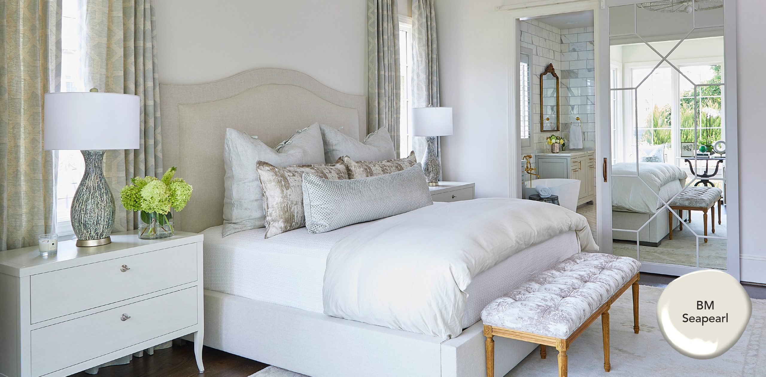
When combining elegant fabrics and textures, choosing a creamy white balances the room perfectly.
Laurie coated the trim, walls, and ceiling of this bedroom with BM Seapearl. It is a timeless beige that works in all spaces.
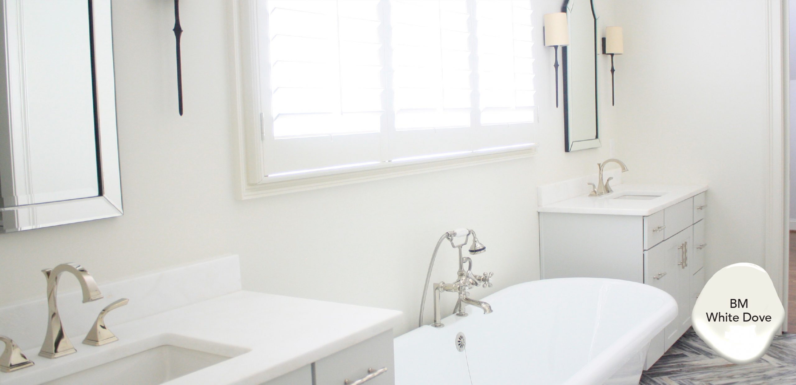
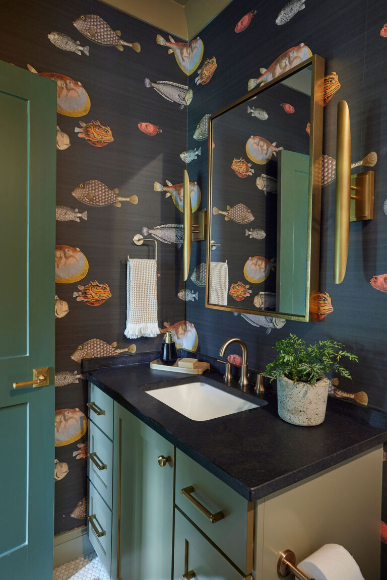
Some whites are her go-to for traditional looks with high impact, as shown in the bath above. BM White Dove is always a secure choice when choosing an immaculate backdrop for walls, cabinets, or trim. It tends to be a softer white than most and contains hints of “greige.”
[one-half-first]
[/one-half-first]
[one-half]
[/one-half]
[clearfix]
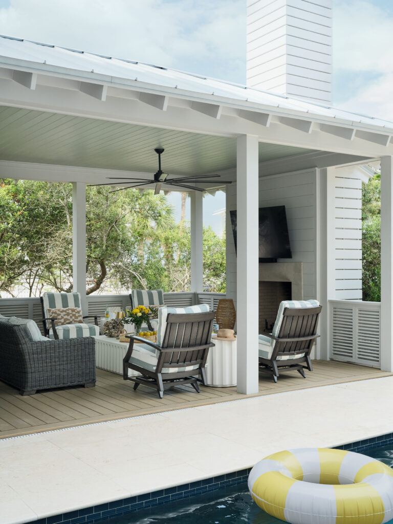
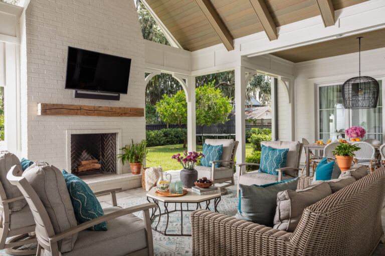
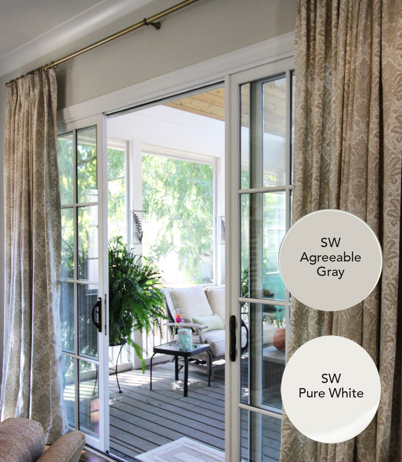
Laurie chose to create a slight variation between the trim and walls to help draw the eye to the outdoor views in this family room. In this particular project Sherwin Williams Agreeable Gray was used on the walls with SW Pure White on the trim.
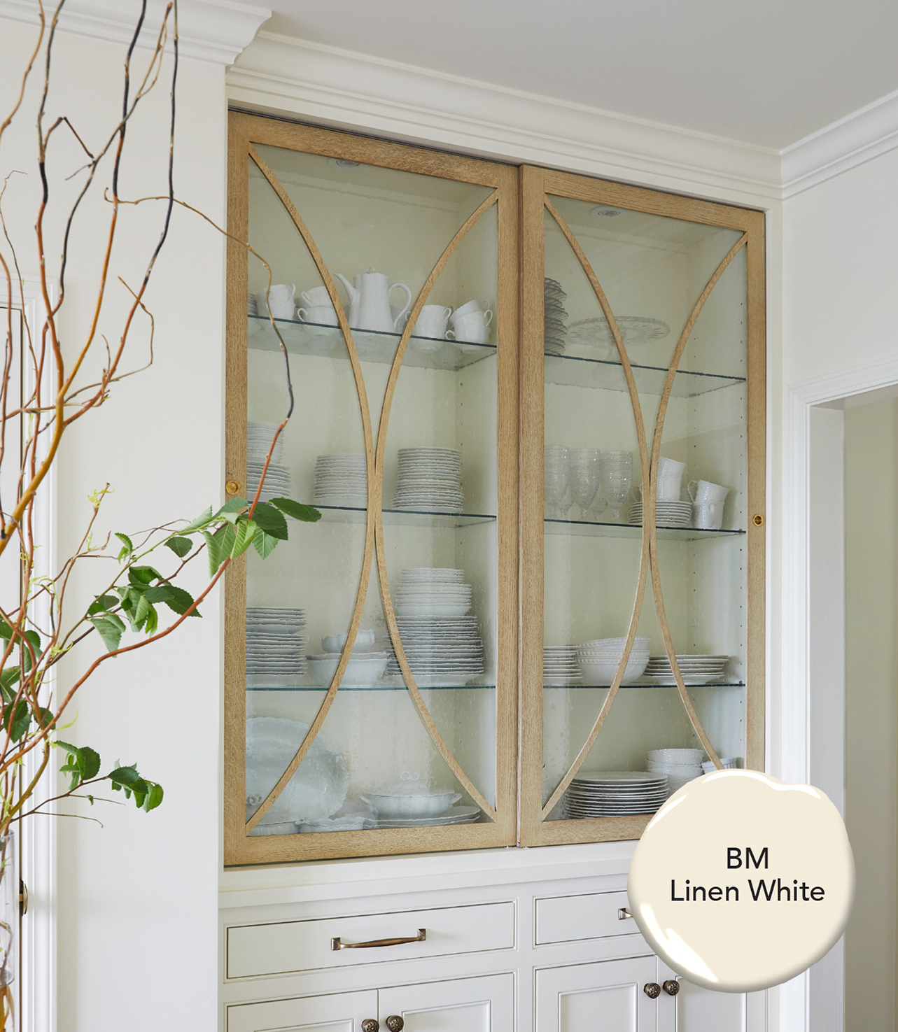
As you may remember in our previous blog post, Laurie chose to extend an existing wall color into the home renovation area to provide unity of the entire space. She chose to paint the wall, trim, and ceiling the same color, BM Linen White, another top-notch choice.
Keeping it Classy with Color
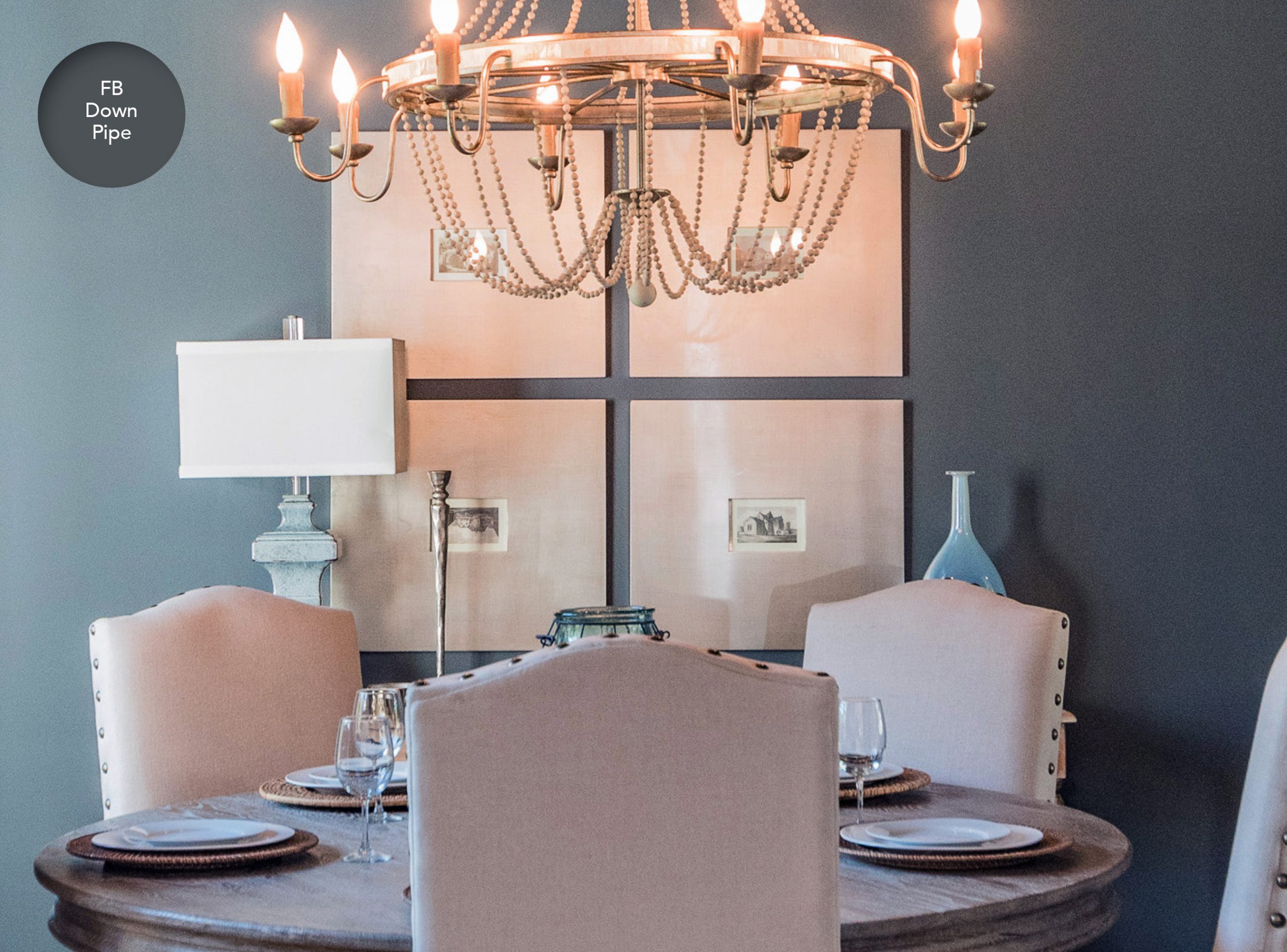
When wanting to add complexity and a dramatic effect without the option of wallpaper, Laurie loves to use her personal favorite Farrow & Ball Down Pipe. It is an uber-rich lead color with blue undertones.
[one-half-first]
[/one-half-first]
[one-half]
[/one-half]
[clearfix]
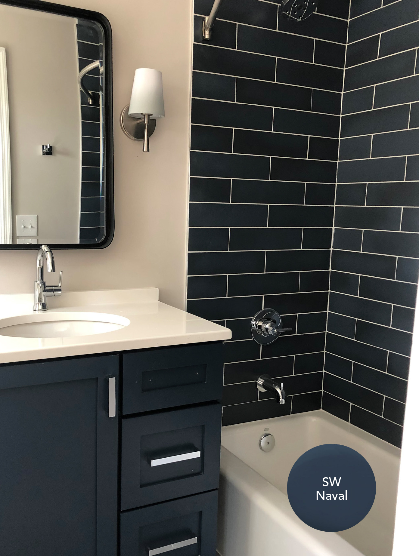
Adding a deep SW Naval navy paint to the vanity cabinets maximized the impact of the bold tile in this bath. Laurie packed a lasting punch in this small space.
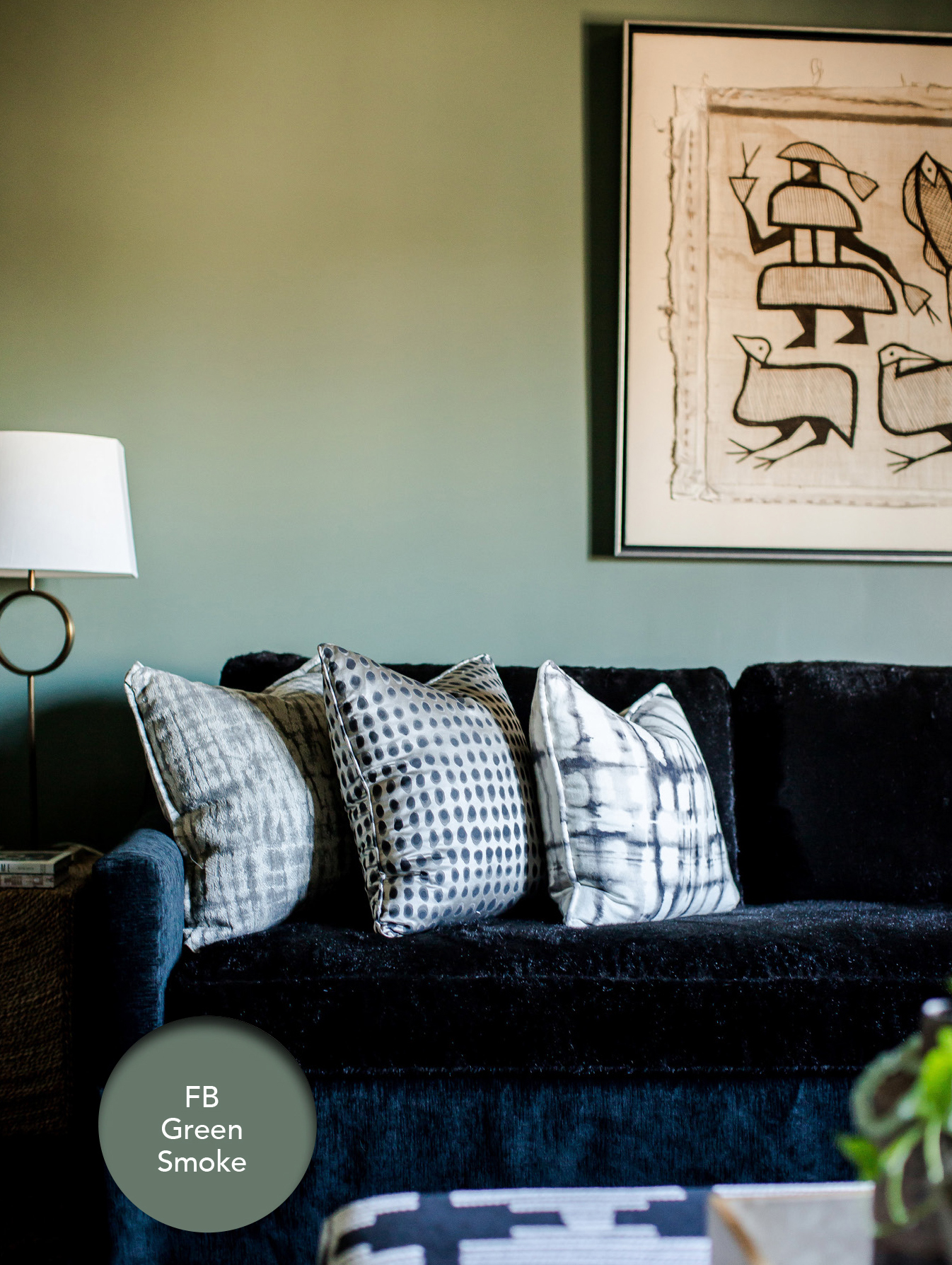
And last but certainly not least, Laurie’s favorite color splash is green. She used F&B Green Smoke in a high gloss for this playful theater room. It is a great pigment-filled neutral and works so well with the contrast of this dark, deep wrap-around sectional.
Whether you choose an all-over neutral or some pops of color, the beauty of paint is that it can last for decades or it can be changed down the road to freshen your look. Our Twin designers will help you choose the perfect colors for your walls, giving your home the vibe you desire and the individuality that you want to express.