Who doesn’t love a good neutral, but what side do you fall under?
All projects need a neutral color that works as a general backdrop to drive the design direction. When I start a project with a client, I like to ask if the client is more of a beige or a gray person. I generally find that clients gravitate to one neutral more than the other.
Best to choose one or the other
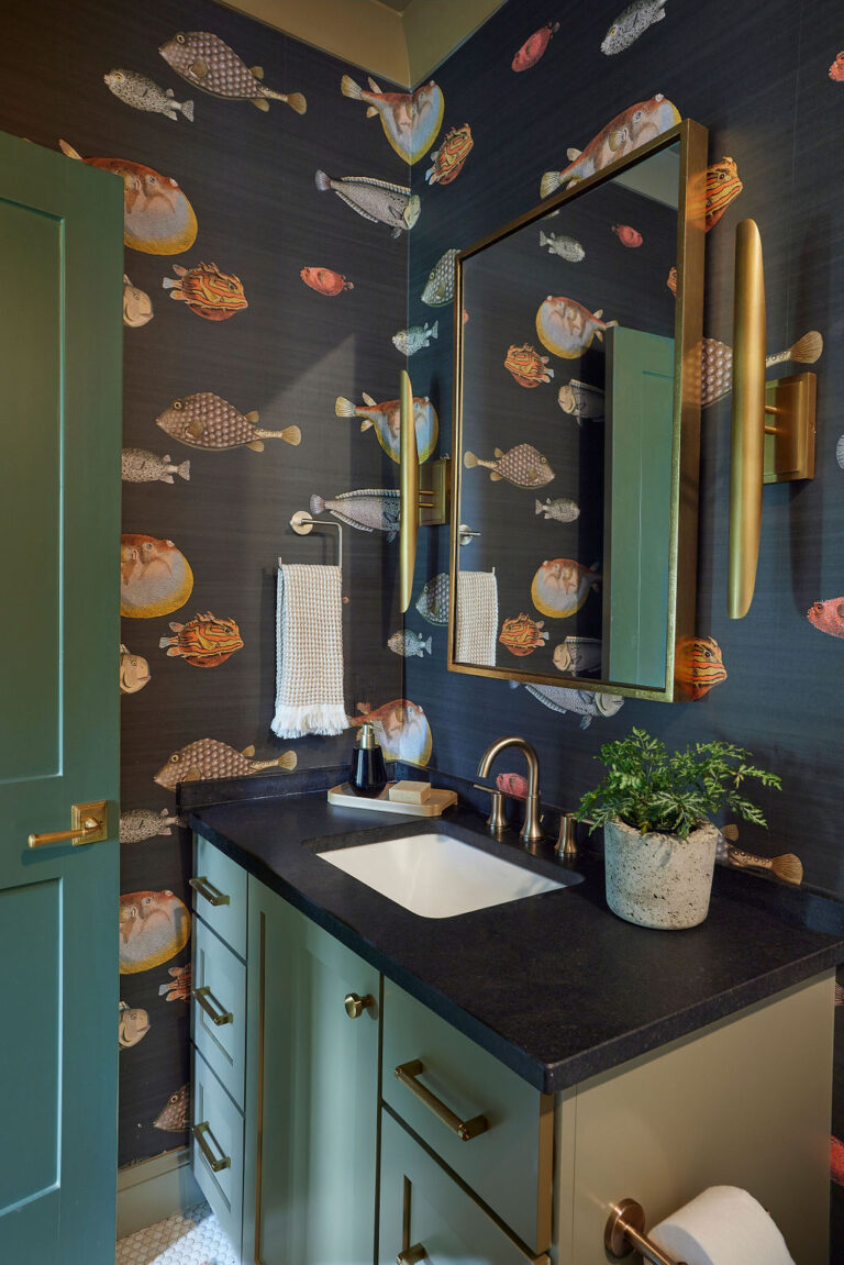
Selecting a neutral doesn’t mean we avoid using other colors in the space; it just means the palette will start with an underlying neutral tone. It’s important to determine which way you lean even if you don’t want to use a lot of that color. By determining your neutral in the beginning, other selections such as cabinet colors, countertops, and tile will be easier to select.
Beige
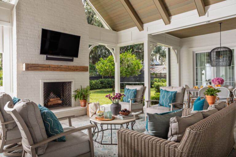
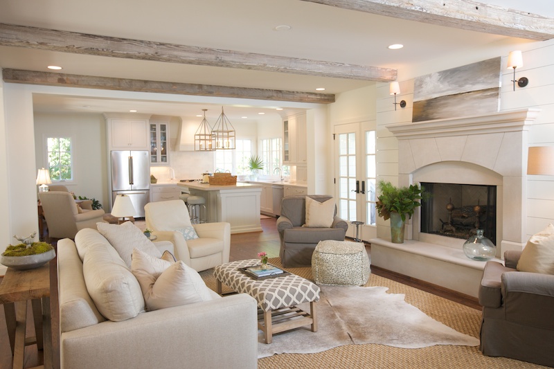
If you lean toward beige, you’ll often like warmer colors such as taupes and browns. Limestones, creamy marbles, oil-rubbed bronze, and copper fixtures will work well in spaces with a beige undertone. When working with beige, it’s important to bring in contrast so the space doesn’t run the risk of looking “muddy” in color. This can be accomplished by bringing in lighter or darker accent pieces.
Beige and color can get along
Softer colors work great with beige. If you want to bring in brighter and more vibrant colors, throw in some darker browns to bring everything together.
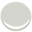
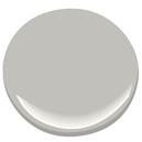
Gray
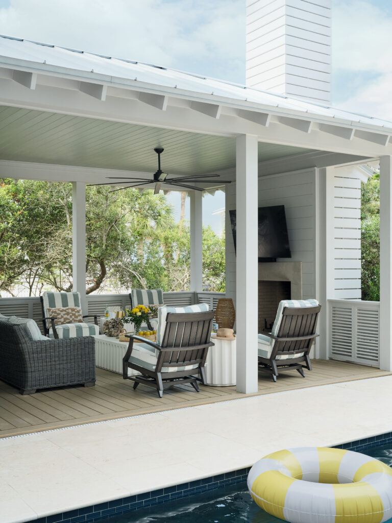
When it comes to gray, you can fall in either the ‘cool’ or ‘warm’ category. Many think gray is a cool color, but there are plenty of warm grays out there to keep your space feeling cozy. Whichever temperature spectrum you fall under, it’s important to keep the rest of your selections in the same undertones. The great thing about a gray palette is that it works well with many types of natural stones. A few of my favorites are Imperial Danby, Carrara marble, Calcutta Borghini, and Statuario.
Color is gray’s best friend
I haven’t found a color that doesn’t work with a gray palette. When paired with a darker gray, colors really pop. To give your space a quick update, simply switch out your accent colors.
No matter which way you lean, there are multiple beautiful colors to choose from. Here are just a few of my favorite paint colors in each color family!
Beige
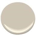
Benjamin Moore- 983 Smokey Taupe
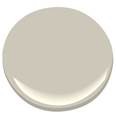
Benjamin Moore- HC-172 Revere Pewter
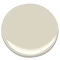
Benjamin Moore- HC-173 Edgecomb Gray
Warm grays
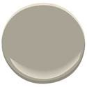
Benjamin Moore- OC-28 Collingwood

Sherwin Williams- 0054 Twilight Gray

Benjamin Moore- HC-105 Rockport Gray
Cool grays
Benjamin Moore- OC-52 Gray Owl
Benjamin Moore- AC-28 Smoke Embers
Sherwin Williams- 6197 Aloof Gray

Danielle Schriefer, Twin Interiors