Hi! It’s me Laurie! One of the perks of my job is seeing first-hand the trends for the year and how they can be incorporated into my clients’ projects. I am not really interested in “trendy” things, but prefer to use classic and timeless pieces as a foundation, while integrating items that are new and exciting. I love when a client asks me to “help them step out of their comfort zone” and, lucky for me, there are so many resources available to help reach that goal!
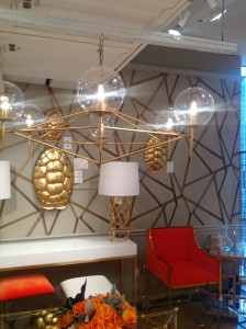
Color was everywhere at the January Atlanta market! I saw a lot of navy, pink, green and camel. Gray is still going strong, but mixed with a lot of color. It is hard to pick a favorite, but see which one catches your eye! (Please do not judge my photography skills. These are taken with my iPhone. I am NOT a photographer and envy my friends who have that skill!)
Since I seem to be asked about paint colors A LOT, here are some new favorites:
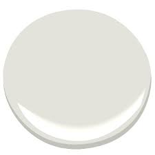
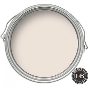
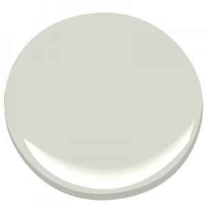
1.More than a few of my clients have made this request, “I want my room painted a light color. Not white. Not cream. Not gray. You know, just pick that color for me.” Hmmmmm, what about one of these?
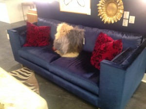
2. Blue – A very popular hue of this color was seen a lot at market. Not a true navy or royal, but an in-between. Whatever it’s called, it is stunning! I ordered the sofa below for a client in a beautiful shade of this popular color.
3. Gray Blue – BM Moonshine is a winner every time. It has just the right amount of blue and gray in it, making it one of my go-to colors. I’ve used it on walls and ceilings.
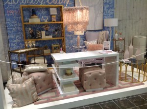
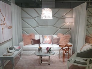
4. Blush – Of course, the Pantone color of the year was the Queen of the ball. They call it Rose Quartz, but this Southern girl calls it “blush”. (I may be able to cite every line of Steel Magnolias J ) This vignette stopped me in my tracks at market, and I could have stared at it for hours.
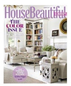
Oh, and don’t forget to pick this up. The March edition is FULL of beautiful color that will surely inspire you to use YOUR favorite color in your home.


