Hello! This is Laurie. I’m a designer for Twin Interiors and am thrilled about the new Twin blog. In the upcoming weeks, I’ll be telling you about my absolute favorite interior topics and things.
The one question I’m most frequently asked as a designer is, “how do I select paint colors?” It’s a difficult task and one that definitely deserves it’s very own blog posting.
My friends keep telling me I have a weird obsession with paint. I LOVE paint. I LOVE picking it out and can usually name the paint color when I walk into any room. So, bear with me as my enthusiasm for this topic is expressed in many ALL-CAP words.
First, I MUST tell you that every paint color does not translate to every house. Lighting is a huge factor. It changes everything. So, always sample a paint color on the wall before committing. Repeat after me…ALWAYS sample a paint color on the wall!
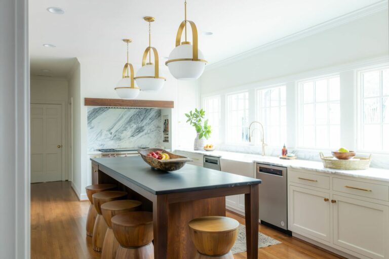
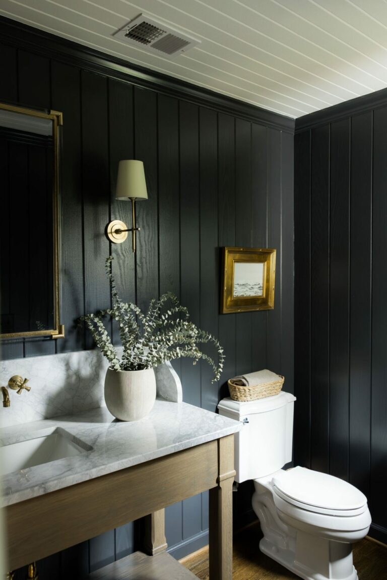
Designing at Twin Interiors, I get the opportunity to pick out paint for many rooms. My DESTINY! I try my best to create a unique palette for every client, as I want each home to reflect the individuals that live there. Therefore, it’s been difficult to narrow my long list of favorites down to five…but here they are…
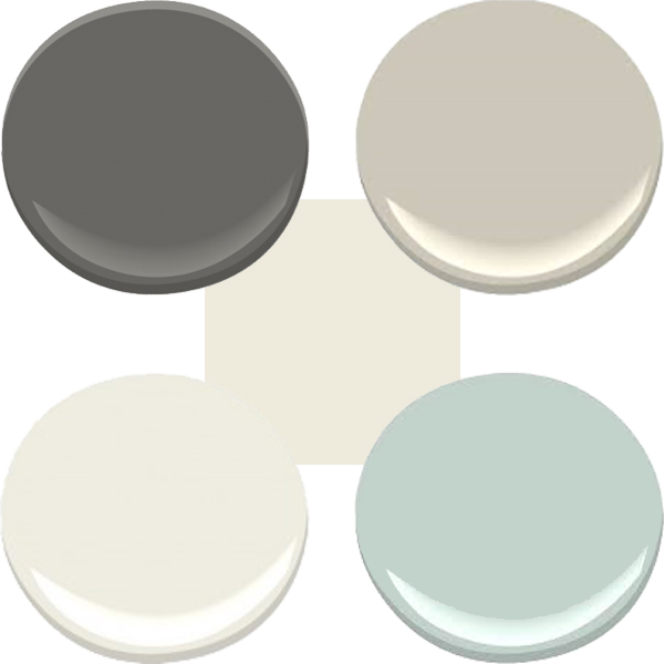
1. White: Benjamin Moore Swiss Coffee

BM Swiss Coffee has been a favorite of mine for a while even if it is a little hard to see on here. With a touch of gray, the color is white without being stark white. My husband still says “looks white to me” which is why I usually don’t ask him!
2. Blue: Benjamin Moore Palladian Blue
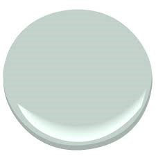
I’ve had a long-time love affair with BM Palladian Blue. My previous home office was painted BM Palladian Blue and it simply made me HAPPY when I walked in. I recommend this color to many clients because it’s so versatile – great in many spaces for grown-ups, tweens and children.
3. Greige: Benjamin Moore Revere Pewter
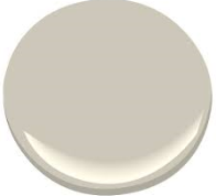
I’m not sure if greige is even a real color (!!!), but it’s a staple in the design field. I describe it as not tan and not gray. BM Revere Pewter is a wonderful mix of both. I’ve recommended this color many times for clients and it usually ends up being their favorite.
4. Gray: Benjamin Moore Kendall Charcoal
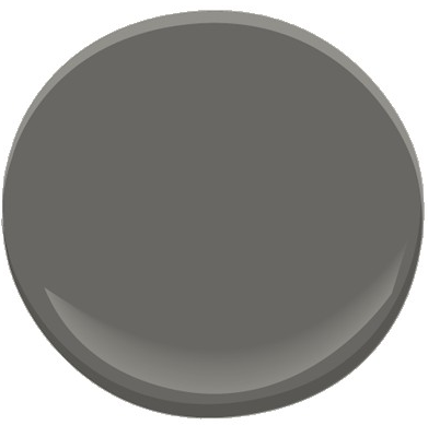
OK, this was a hard one for me. I LOVE so many grays but varying undertones make them difficult to recommend. I’ve painted samples that turned blue or even purple on the wall. BM Kendall Charcoal is pretty reliable. However, PLEASE, test your gray before committing.
5. Cream: Sherwin Williams Creamy

I have a client that asked me to make her paint selections while she was out of town. She told me two words before she left, “creamy dreamy”. So I had her walls and trim painted this color. My client was overjoyed when she returned home. Creamy is simply a staple.
It’s difficult for me to end my first paint post here. I could talk/write for HOURS about paint and there are so many colors to cover. However, I promise to post about other colors soon. Who doesn’t love a cliff hanger!!!